A total of 11181 characters, expected to take 28 minutes to complete reading.
Getting started with Python library Matplotlib
Matplotlib is a comprehensive library for creating static, animated, and interactive visualizations in Python. Matplotlib make easy things easier and make difficult things possible.
install
Install directly with the pip command
pip install matplotlib
Installation in PyCharm
主菜单 - 设置 - 项目 -Python 解释器 -+
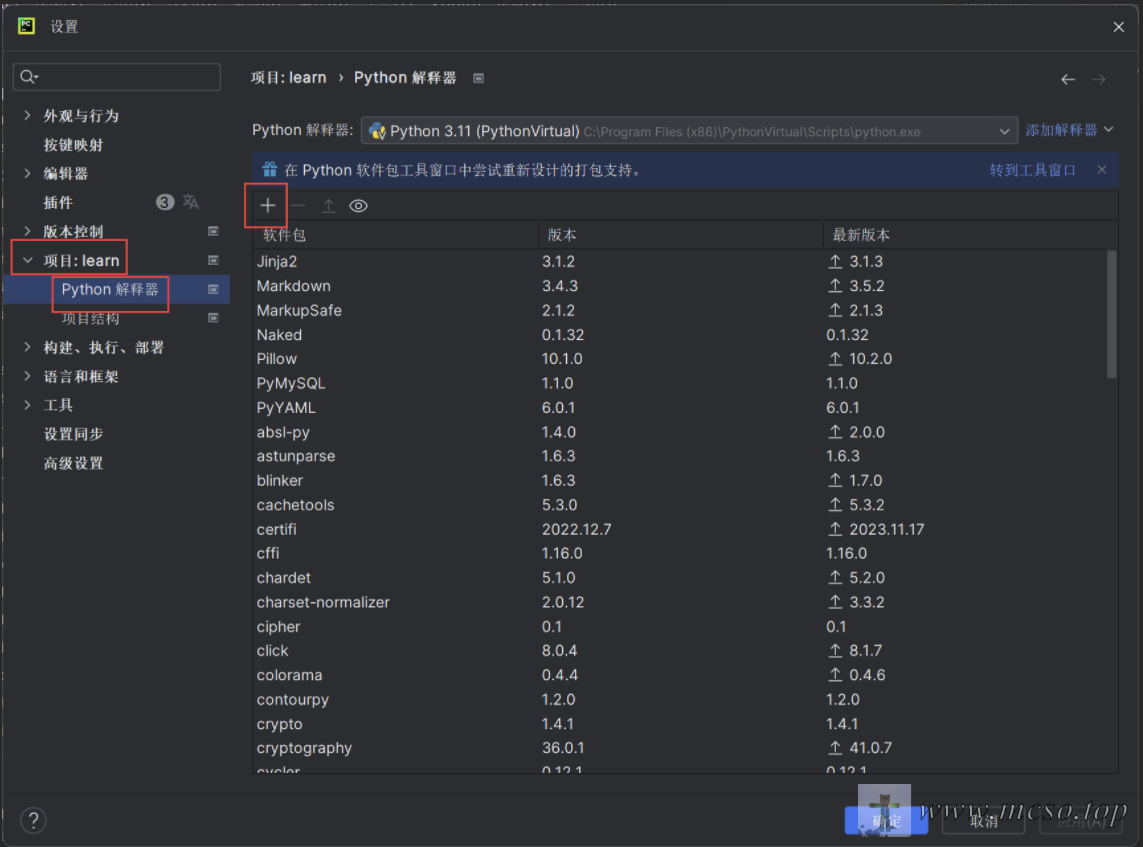
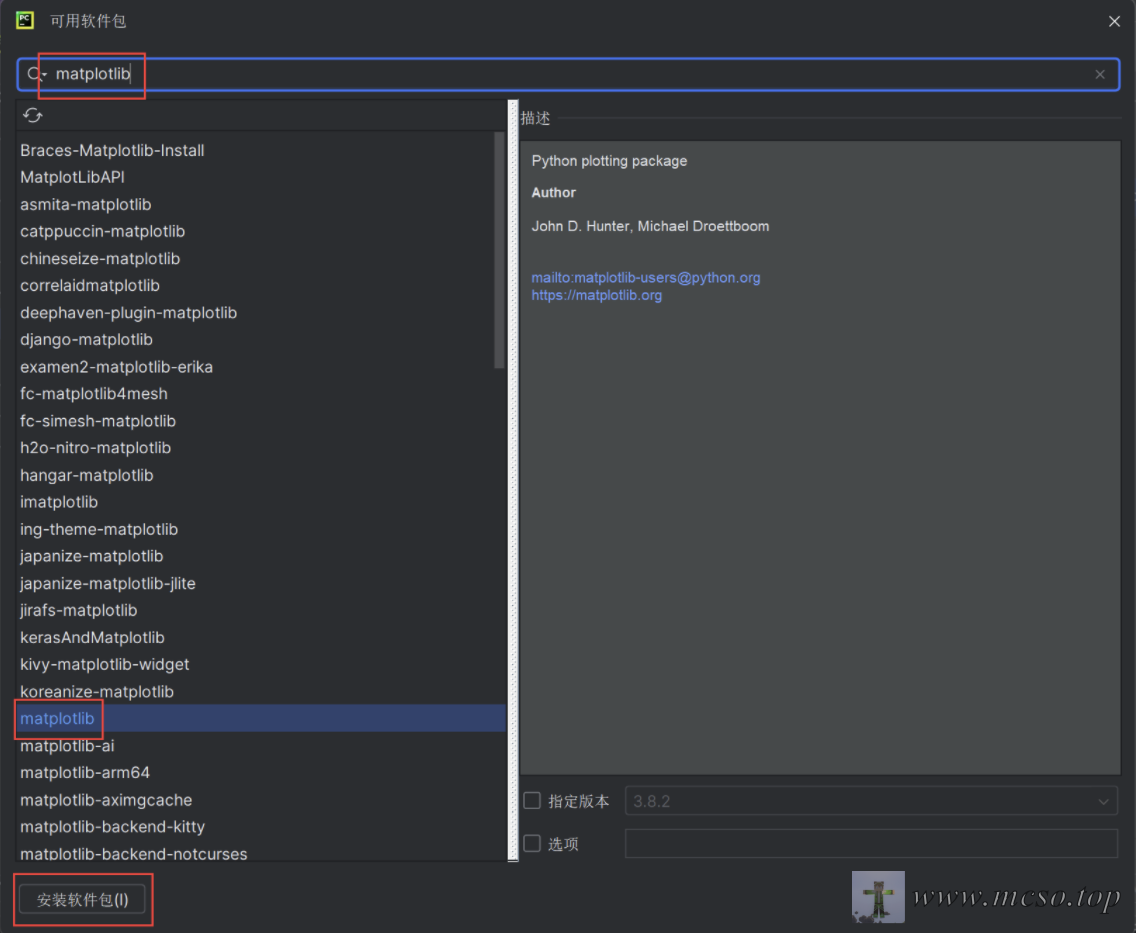
搜索 matplotlib- 点击 - 安装软件包
official website download installation package
Import Software Package
# 导入 pyplot
import matplotlib.pyplot as plt
# 导入 numpy
import numpy as np

import matplotlib as mpl
Basic use
Composition
The following picture shows the components of the MatplotLib
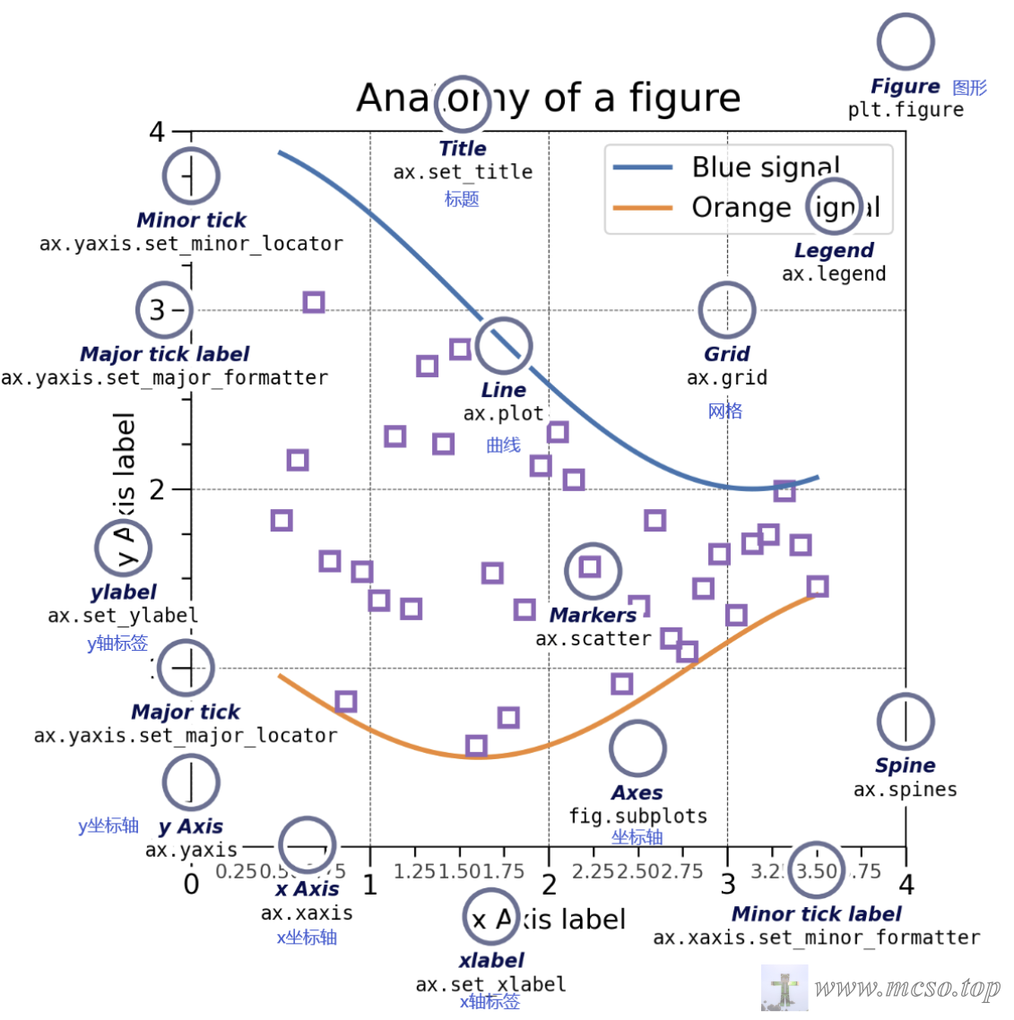
First the biggest part is Figure, contains all the contents of the interface: Coordinate System (Axes), Sub-graph (SubFigure)labels, curves, and so on.
Use plt.figure() You can quickly create a graphic.
Coordinate System (Axes) Is the place contained in the drawing for drawing coordinate data, usually containing two or three (two-dimensional or three-dimensional) Axis (Axis). can be usedax.plot() to quickly plot coordinate data.
Axis (Axis) Similar to the mathematical coordinate axis, you can set the scale and length, and there are marks (values, etc.) on the corresponding scale.
Element (Artist) Basically all visible graphics are primitives (even graphics, coordinate systems, and axes), when Figure When rendered, all primitives will be displayed in Canvas On.
Code Exercises
Quickly create a basic coordinate system
# 使用 plt.subplots() 可以快速创建一个带坐标系的图形
# fig 代表 Figure(图形)
# ax 代表 Axes(坐标系)
fig, ax = plt.subplots()
# 调用坐标系绘制数据
# 坐标 (x,y) 分别为 (1,1) (2,3) (3,2)
ax.plot([1, 2, 3], [1, 3, 2])
# 展现图形
plt.show()
# 保存图形
plt.savefig("test.png")
coordinate system expansion
Create an empty graphicfig = plt.figure()
Create a coordinate system with a 2 × 2 gridfig, axs = plt.subplots(2,2)
Create a graph with one axis on the left and two axes on the rightfig, axs = plt.subplot_mosaic([["left", "right_top"], ["left", "right_bottom"]])
Implement visual charts
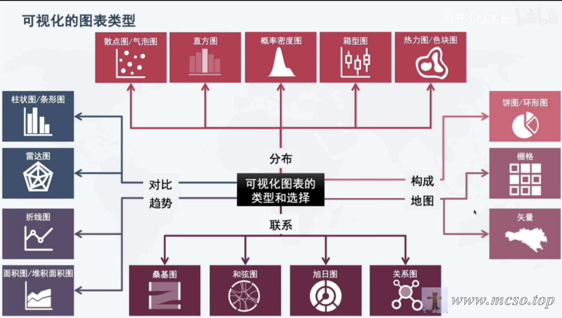
Visualize the distribution
Scatter & Bubble
Use plt.scatter() The method can draw a scatter plot, which can visually show the overall relationship trend between the influencing factors and the prediction object.
matplotlib.pyplot.scatter(x, y, s=None, c=None, marker=None, cmap=None, norm=None, vmin=None, vmax=None, alpha=None, linewidths=None, *, edgecolors=None, plotnonfinite=False, data=None, **kwargs)
Parameter description:
X, y: an array of the same length, that is, the data points that we are about to draw a scatter plot, and enter the data.
s: the size of the point, the default value is 20, or it can be an array, and each parameter of the array is the size of the corresponding point.
C: The color of the point, the default blue 'B', can also be an RGB or RGBA two-dimensional row array.
marker: the style of the point. the default small circle 'o '.
Cmap: Colormap, default None, scalar or a colormap name, only used when C is a floating point array. If there is no declaration, it is image.cmap.
norm:Normalize, default None, data brightness between 0-1, only used when c is an array of floating point numbers.
vmin,vmax:: brightness setting, which is ignored when the norm parameter exists.
alpha:: transparency settings, 0-1, the default None, that is, opaque.
linewidths:: Length of the marker point.
edgecolors:: Color or color sequence. The default value is 'face'. Optional values are 'face', 'none', and None.
plotnonfinite:: Boolean that sets whether to use an unqualified c (inf, -inf, or nan) to draw points.
Examples are as follows:
# 快速创建一块图形和一个二维坐标系
fig, ax = plt.subplots()
# 设置 x 轴为 0~3π,共有 30 个点
x = np.linspace(0, 3 * np.pi, 30)
# y 轴为 sin(x)
y = np.sin(x)
# 随机设置这 30 个点的大小
# 即得到长度为 30 的随机数一维数组
s = np.random.randint(0, 60, size=(30))
# 所有点的颜色为红色
c = "red"
# 在坐标系中绘制
ax.scatter(x, y, s, c)
# 显示画布
plt.show()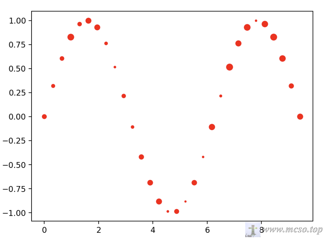
Put c = "red" Changed c = np.random.randint(0, 100, size=(30)) You can also get an image with a random color distribution:
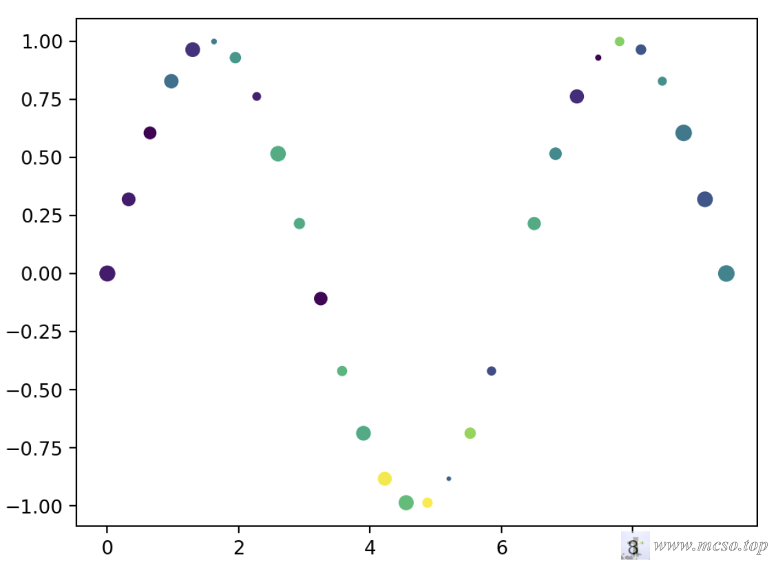
np.random.randint(0, 100, size=(30))A random one-dimensional array of length 30 can be obtained, with values between 0 and 100, and the array obtained in the above graph is[11 11 4 37 17 41 51 12 59 58 5 62 58 91 65 92 32 76 25 51 58 46 16 4 73 28 49 40 28 44]. The matplotlib provides a variety of color bars, where the number 0 to 100 represents different colors.
Histogram
Use plt.hist() The method can draw histograms, which are easy to observe the central trend, bias and outliers of the data.
matplotlib.pyplot.hist(x, bins=None, range=None, density=False, weights=None, cumulative=False, bottom=None, histtype='bar', align='mid', orientation='vertical', rwidth=None, log=False, color=None, label=None, stacked=False, **kwargs)
Parameter description:
x: Indicates the data to be plotted as a histogram, which can be a one-dimensional array or list.
bins: optional parameter, indicating the number of bins in the histogram. The default is 10.
range: optional parameter, indicating the range of the histogram range, which can be a two-tuple or list. The default is None, that is, the minimum and maximum values in the data are used.
density: Optional. Indicates whether to normalize the histogram. The default is False, that is, the height of the histogram is the number of samples in each box, not the frequency or probability density.
weights: Optional parameter that represents the weight of each data point. The default is None.
cumulative: optional parameter that indicates whether to draw a cumulative distribution map. The default is False.
bottom: optional parameter, indicating the starting height of the histogram. The default is None.
histtype: optional parameter, indicating the type of histogram, which can be 'bar', 'barstacked', 'step', 'stepfilled', and so on. The default is 'bar '.
align: optional parameter, indicating the alignment of the histogram box, which can be 'left', 'mid', or 'right '. The default is 'mid '.
orientation: optional parameter, indicating the direction of the histogram, which can be 'vertical' or 'horizontal '. The default is 'vertical '.
rwidth: Optional, indicating the width of each box. The default is None.
log: Optional parameter indicating whether to use a logarithmic scale on the y-axis. The default is False.
color: optional parameter, indicating the color of the histogram.
label: optional parameter, indicating the label of the histogram.
stacked: optional parameter indicating whether to stack different histograms. The default is False.
**kwargs: optional parameters, representing other drawing parameters.
Code example:
To implement a histogram of individual data:
# 快速创建一块图形和一个二维坐标系
fig, ax = plt.subplots()
# 生成正态分布的一维数组 有 1000 个元素
data = np.random.randn(1000)
# 以 data 为数据生成一个直方图
# bins 为直方图的条数 分为 50 条
# color 为天蓝色
# alpha 为颜色的透明度 80%
ax.hist(data, bins=50, color="skyblue", alpha=0.8)
# 显示画布
plt.show()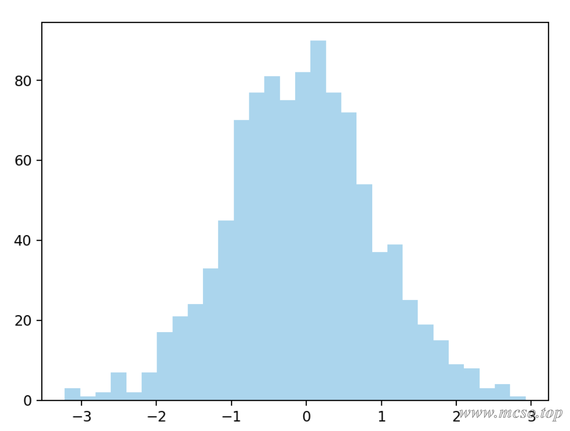
If you have multiple data to compare, you can use the following methods:
fig, ax = plt.subplots()
# 生成正态分布的两个不同的一维数组
data1 = np.random.randn(1000)
data2 = np.random.randn(1000)
# 一个为天蓝色的 label 标签为 Data 1
ax.hist(data1, bins=50, label="Data 1", color="skyblue", alpha=0.5)
# 一个为粉色的 label 标签为 Data 2
ax.hist(data2, bins=50, label="Data 2", color="pink", alpha=0.5)
# 展示数据的标签 即刚才设置的 label
plt.legend()
plt.show()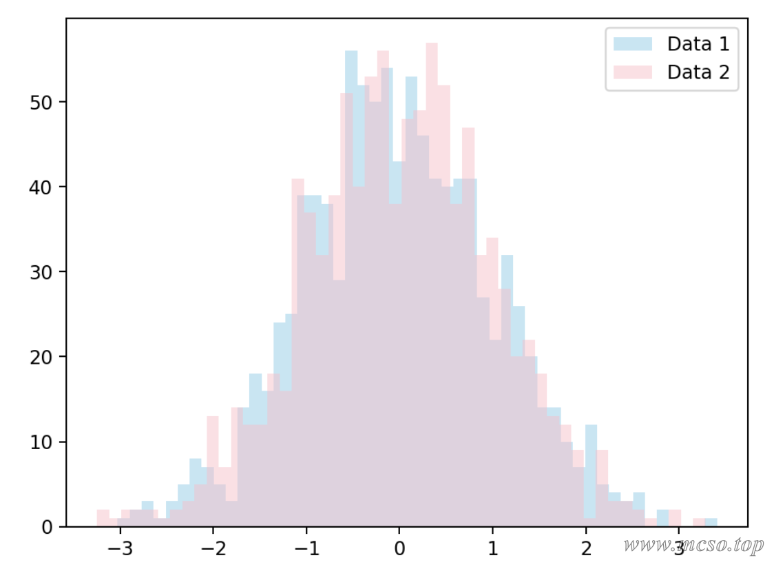
probability density graph
Probability density maps can be used to show the density distribution of data.
Drawing probability density maps requires seaborn, usingpip install seaborn to install. Use the software package under seaborn.distplot() A probability density profile may be implemented.
seaborn.distplot(a, bins=None, hist=True, kde=True, rug=False, fit=None, hist_kws=None, kde_kws=None, rug_kws=None, fit_kws=None, color=None, vertical=False, norm_hist=False, axlabel=None, label=None, ax=None)
Parameter description:
a:1-dimensional array or list.
bins: displays the number of histograms
hist: Boolean value, whether to draw a histogram
kde: Boolean value, whether to draw a density curve
rug: Boolean value, whether to draw the vertical line of the observation on the horizontal axis
fit: An object with a fit method that returns a tuple.
hist_kws: Keyword parameter of the underlying drawing function.
kde_kws: Keyword parameter of the underlying drawing function.
rug_kws: Keyword parameter of the underlying drawing function.
color: the color of everything outside the curve
vertical: Boolean value, whether the observation is displayed in the y-axis.
label: label of the graph
The following is an example:
# 创建一个正态分布的一维数组 有 10000 个数据点
data = np.random.randn(10000)
# 画出这个数据的密度曲线 不画出直方图
# 把 hist 改成 True 即可显示直方图
sns.distplot(data, hist=False, kde=True)
# 显示画布
plt.show()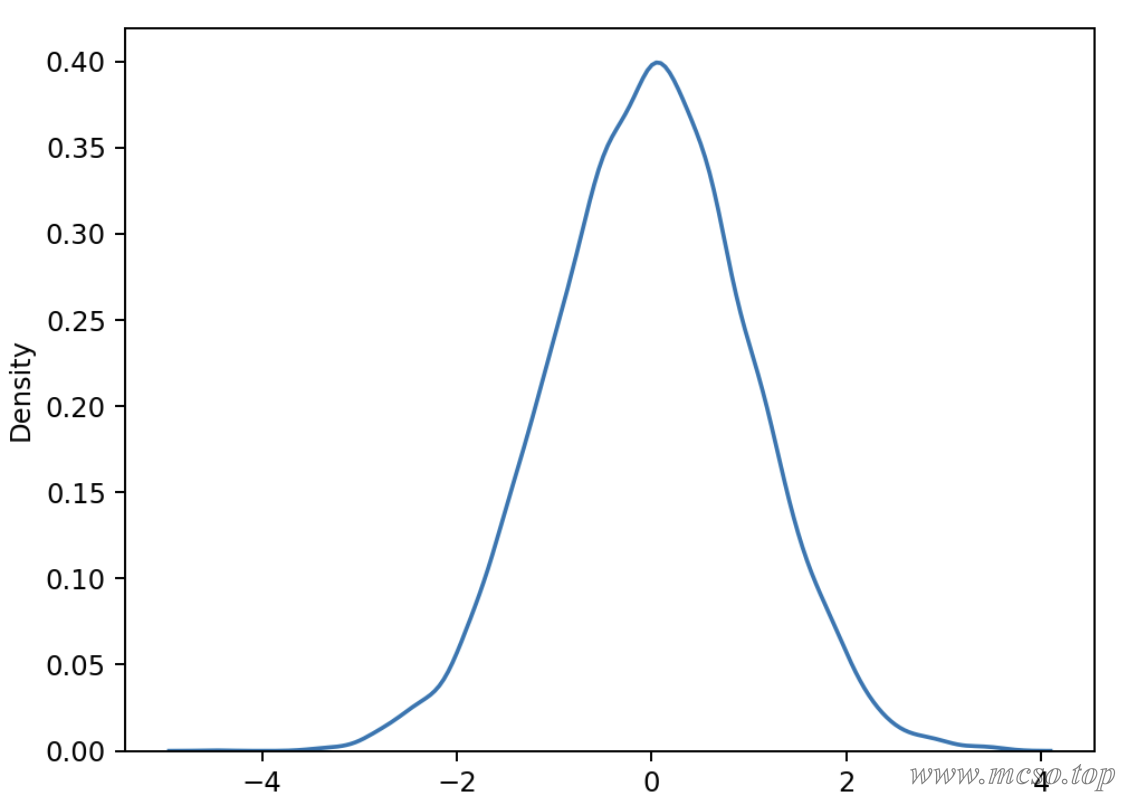
Box drawing
A box chart is a statistical chart used to display the dispersion of a set of data. It is named after the figure is like a box and the lines that often extend like a beard outside the upper and lower quartiles.
The shape of the box diagram is as follows:
Q1-1.5IQR   Q1   Q2    Q3   Q3+1.5IQR
            |-----:-----|
   |--------|     :     |--------|
            |-----:-----|
            <----------->
                 IQR
Q2: Median of all data
Q1: Lower quartile (median of all data below median)
Q3: Upper quartile (median of all data above median)
IQR: distance from upper and lower quartiles
Q1-1.5IQR: Lower bound for all data
Q3 1.5IQR: Upper limit for all data
Use plt.boxplot() method can draw a box diagram.
matplotlib.pyplot.boxplot(x, notch=None, sym=None, vert=None, whis=None, positions=None, widths=None, patch_artist=None, bootstrap=None, usermedians=None, conf_intervals=None, meanline=None, showmeans=None, showcaps=None, showbox=None, showfliers=None, boxprops=None, labels=None, flierprops=None, medianprops=None, meanprops=None, capprops=None, whiskerprops=None, manage_ticks=True, autorange=False, zorder=None, *, data=None)
Parameter description:
x: Specifies the data to plot the boxplot
notch: whether the box line diagram is displayed in the form of a notch
sym: specifies the shape of the anomaly
vert: whether it is necessary to place the box line diagram vertically
Whis: Specify the distance between the upper and lower quarts.
positions: Specify the location of the boxplot
widths: Specifies the width of the boxplot
patch_artist: whether to fill the color of the box
meanline: Whether to express the mean in the form of a line.
showmeans: Show Mean or not
showcaps: whether to display the two lines at the top and end of the boxplot
showbox: whether to display the box of the box line drawing
showfliers: Show outliers or not
boxprops: Set the properties of the box, such as border color, fill color, etc.
labels: add labels to the box line graph, similar to the legend
filerprops: Set the properties of the abnormal value, such as the shape, size, fill color, etc.
medianprops: Set the properties of the median, such as the type and thickness of the line.
meanprops: Set the properties of the mean, such as the size of the point, color, etc.
capprops: Set the properties of the top and end lines of the box line chart, such as color, thickness, etc.
whiskerprops: Set the required properties, such as color, thickness, line type, etc.
Code example:
fig, ax = plt.subplots()
# 以正态分布生存 3 组数据
data1 = np.random.randn(1000)
# 第二组数据开平方
data2 = np.random.randn(1000) ** 2
# 第三组数据开立方
data3 = np.random.randn(1000) ** 3
# 绘制 3 个数据的箱型图 不显示异常值
ax.boxplot([data1, data2, data3], showfliers=False)
# 显示画布
plt.show()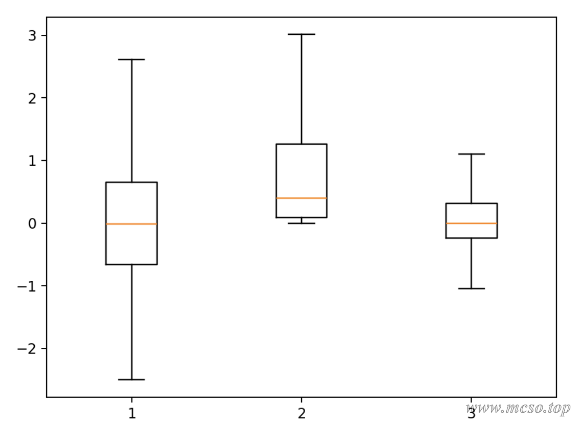
Color Block Diagram & Thermal Diagram
The heat map refers to the two classification fields represented by the X axis and the Y axis to determine the position of the numerical point, and the size of the numerical value is represented by the rectangular color of the corresponding position, and the value represented by the color depth is large.
In matplotlib, use plt.imshow() The method can quickly draw a heat map (or picture).
imshow(X, cmap=None, norm=None, aspect=None, interpolation=None, alpha=None, vmin=None, vmax=None, origin=None, extent=None, shape=None, filternorm=1, filterrad=4.0, imlim=None, resample=None, url=None, *, data=None, **kwargs)
Parameter description:
X: Input data. Can be a two-dimensional array, a three-dimensional array, a PIL image object, a matplotlib path object, etc.
cmap: Color mapping. Used to control the color of different values in the image. You can choose the built-in color mapping, such as gray, hot, jet, etc., or you can customize the color mapping.
norm: controls the normalization of values. A normalization method such as Normalize, LogNorm, etc. may be selected.
aspect: Controls the aspect ratio of the image. Can be set to auto or a number.
interpolation: Interpolation method. Used to control the degree of smoothness and detail of the image. Interpolation methods such as nearest, bilinear, and bicubic can be selected.
alpha: The transparency of the image. The value range is 0~1.
origin: the position of the origin of the coordinate axis. Can be set to upper or lower.
extent: Controls the range of data displayed. can be set to [xmin, xmax, ymin, ymax].
vmin, vmax: controls the value range of the color mapping.
filternorm and filterrad: Objects used for image filtering. Can be set to None, antigrain, freetype, etc.
imlim: Used to specify the image display range.
resample: Used to specify the image resampling method.
url: Used to specify the image link.
Code example:
# 随机生成数据
data = np.random.randn(16, 16)
# 将数据展示为热力图 使用 hot 的色彩空间
plt.imshow(data, cmap="hot")
# 显示颜色对应的数值
plt.colorbar()
# 显示画布
plt.show()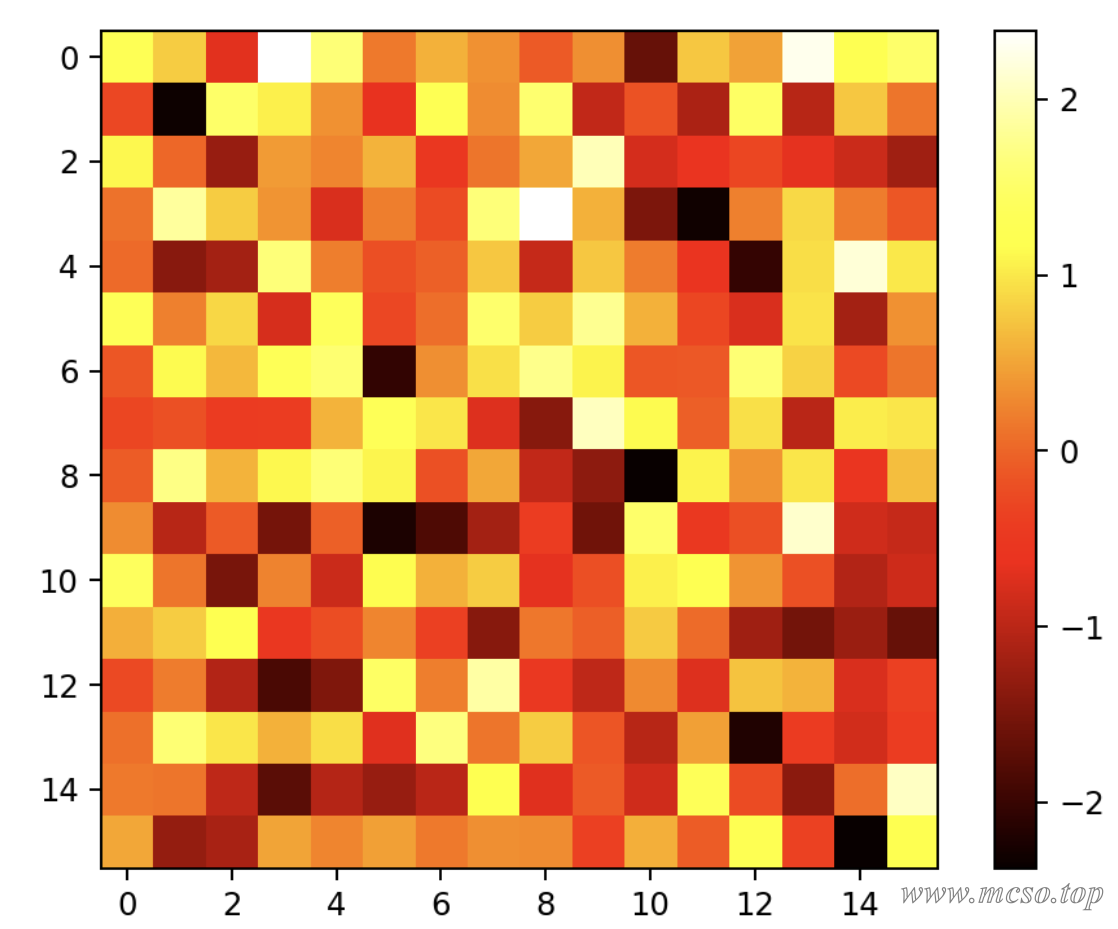
visual contrast
Histogram & Bar Chart
Column chart, also known as bar chart and histogram, is a graph that shows the number or size of statistical indicators by the difference in height or length of bars of equal width.
can be used plt.bar() or plt.barh() to draw a column chart.
matplotlib.pyplot.bar(x, height, width=0.8, bottom=None, *, align='center', data=None, **kwargs)
Parameter description:
x: floating-point array, x-axis data of column chart.
height: floating-point array, the height of the column chart.
width: floating-point array, width of the column chart.
bottom: floating-point array, the y coordinate of the base, default 0.
align: The alignment of the column chart with the x coordinate, 'center' is centered on the x position, which is the default value. 'edge': Aligns the left edge of the column chart with the x position. To align the bars on the right edge, you can pass a negative width value and align = 'edge '.
**kwargs:: other parameters.
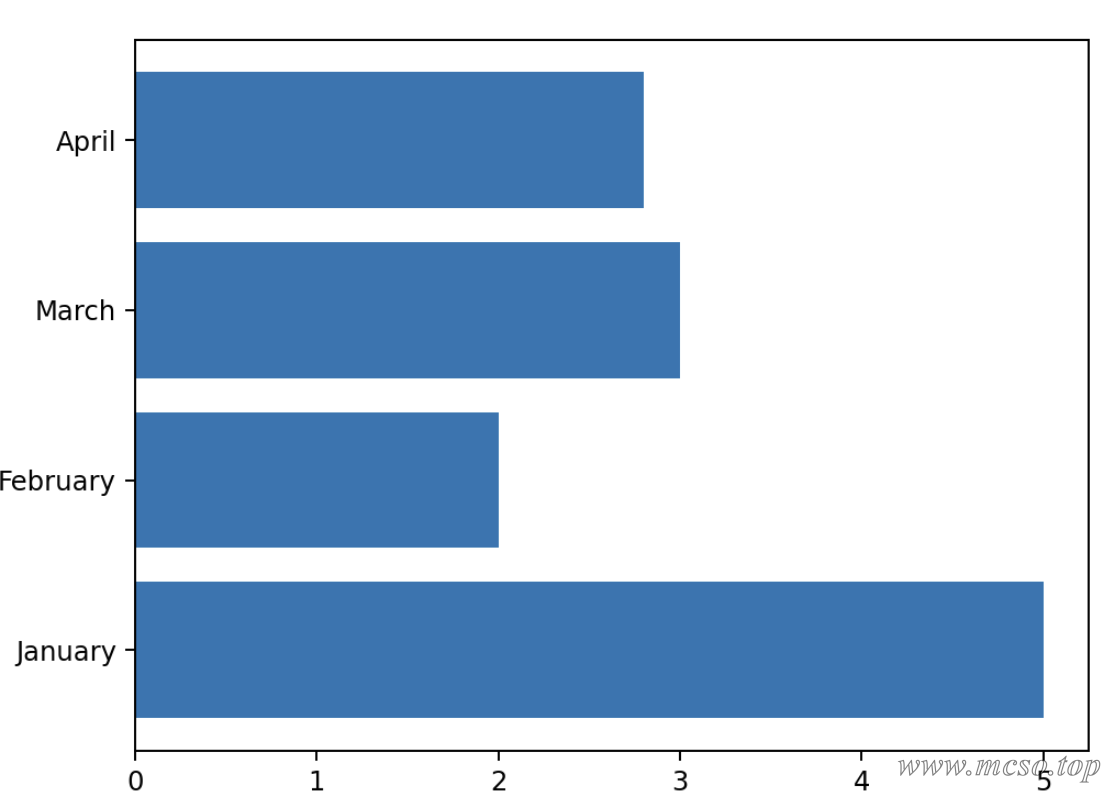
Code example:
# x 轴的标签 是一个一维数组
x_lable = np.array(["January", "February", "March", "April"])
# x 轴标签所对应的数值
height = np.array([5.0, 2.0, 3.0, 2.8])
# 画柱形图
plt.bar(x_lable, height)
# 显示图形
plt.show()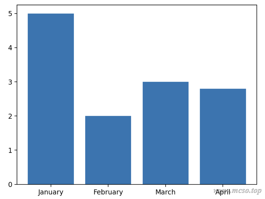
In addition to this, plt.bar() Replace plt.barh() You can draw horizontal histograms:
Radar Chart
A radar chart is a graphical method of displaying multivariate data in the form of a two-dimensional chart of three or more quantitative variables represented on an axis starting from the same point.
Use plt.polar() method can draw a radar chart.
matplotlib.pyplot.polar(**args*, ***kwargs*)
Parameter description:
theta: angle between the ray where each marker is located and the polar diameter
r: the distance of each marker to the origin
marker: marker point style
markersize(ms): Size of the marker point
markerfacecolor(mfc): fill color of the marker point
markeredgecolor(mec): border color of the marker point
color: line color
linestyle(ls):ls = 'None': lines are not displayed
linewidth(lw): line thickness
Code example:
# 把雷达图分成 6 块 即有 6 个数据
bars = 6
bars += 1
# 转过的角度 从 0~2π 分成 7 块 最后一个和第一个重合
theta = np.linspace(0.0, 2 * np.pi, bars)
# 每个角度对应的数据值 最后一个和第一个数据要相同才能闭合
r = np.array([1, 2, 3, 4, 5, 6, 1])
# 绘制雷达图
plt.polar(theta, r)
# 显示图形
plt.show()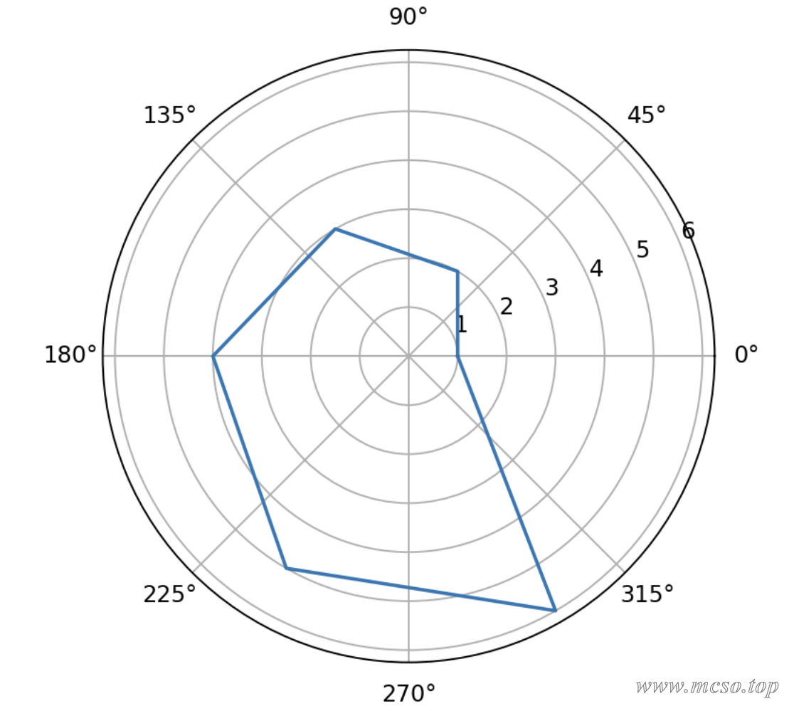
Line Chart
A line chart is a chart in which data arranged in columns or rows of a worksheet can be plotted. A line chart can show continuous data over time (according to a common scale setting), so it is very useful for showing the trend of data at equal time intervals.
Use plt.plot() You can easily draw all the points of the line chart.
Parameter description:
x: The x-axis data for which you want to plot the line chart.
y: The y-axis data for which you want to plot the line chart.
c (optional): Specifies the color of the polyline. The default is blue ("B").
marker (optional): Specifies the marker symbol on the polyline. The default is no tag (no tag lines).
markersize (optional): Specifies the size of the marker symbol. The default is 6.
Code example:
# 快速创建一个二维坐标系
fig, ax = plt.subplots()
# x 和 y 的数据
x = [1, 2, 3]
y = [1, 3, 2]
# 绘制折线图的点
ax.plot(x, y)
# 显示图形
plt.show()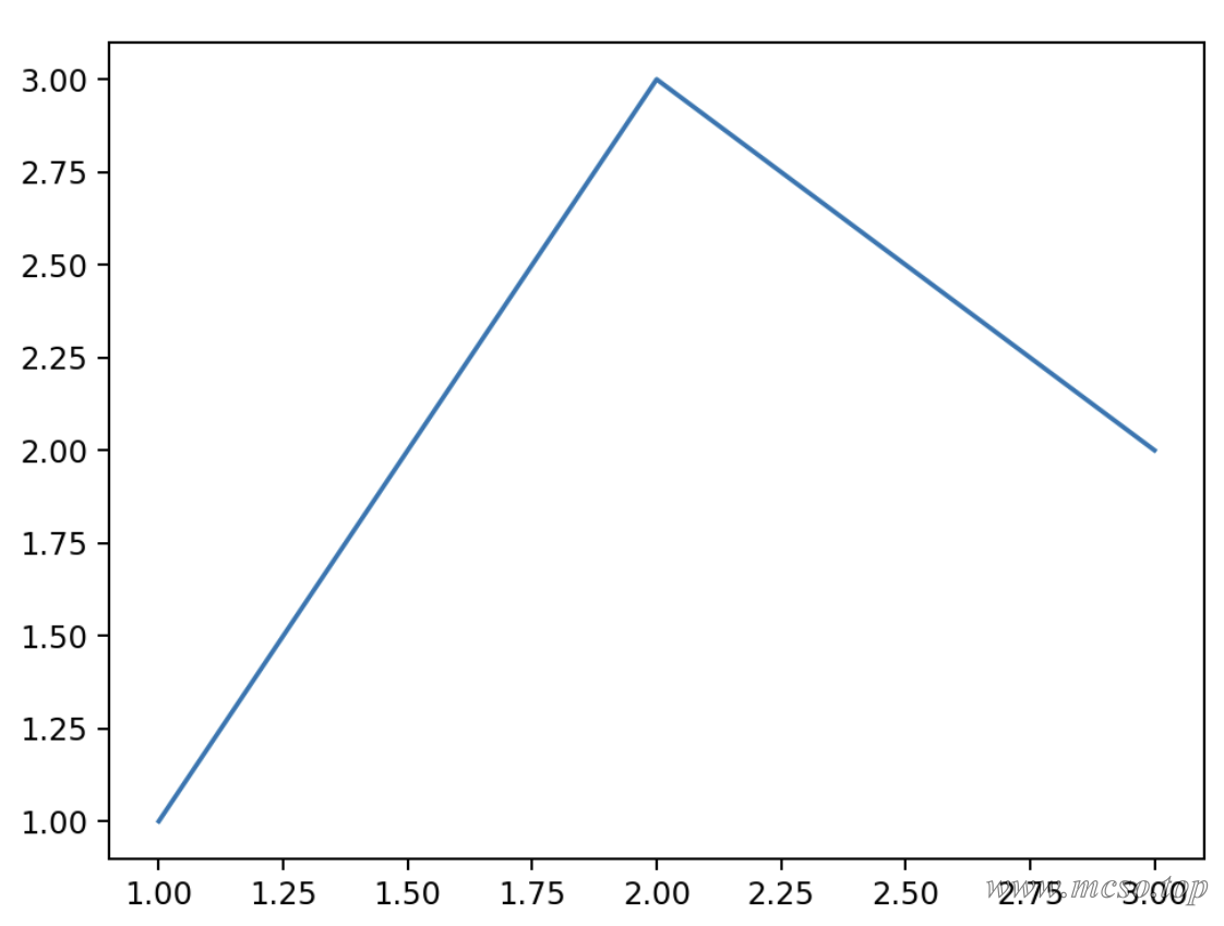
Area Chart
Area charts emphasize the extent to which quantities change over time and can also be used to draw attention to trends in aggregate values.
Use plt.stackplot() You can draw an area map, and its use is the same plt.plot() Similar.
Code example:
# 快速创建一个二维坐标系
fig, ax = plt.subplots()
# x 和 y 的数据
x = [1, 2, 3]
# y 有两个堆叠的数据
y = [[1, 3, 2], [2, 1, 1]]
# 绘制折线图的点
# 颜色分别为粉色和天蓝色 透明度为 0.5
ax.stackplot(x, y, colors=["pink", "skyblue"], alpha=0.5)
# 显示图形
plt.show()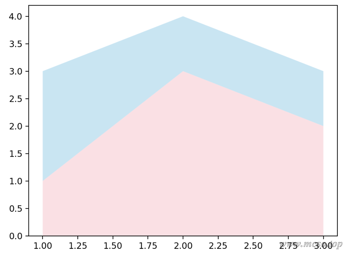
Show contact
Sankey diagram
chord chart
Rising Sun Chart
Diagram
Presentation Composition
Pie Chart
A pie chart is a circular chart that expresses the relative relationship of values, proportions, or frequencies by dividing the circle into different sectors.
matplotlib provided plt.pie() Method to draw a pie chart.
matplotlib.pyplot.pie(x, explode=None, labels=None, colors=None, autopct=None, pctdistance=0.6, shadow=False, labeldistance=1.1, startangle=0, radius=1, counterclock=True, wedgeprops=None, textprops=None, center=0, 0, frame=False, rotatelabels=False, *, normalize=None, data=None)[source]
Parameter description:
x: floating-point array or list, used to plot pie chart data, representing the area of each sector.
explode: an array that represents the interval between sectors. The default value is 0.
labels: the label of each sector. The default value is None.
colors: an array representing the color of each sector. The default value is None.
autopct: Set the display format of percentage of each sector in the pie chart, such as %d%% integer percentage, %0.1f one decimal place, %0.1f%% one decimal place percentage, and %0.2f%% two decimal places percentage.
labeldistance: The drawing position of the label, relative to the radius. The default value is 1.1. If <1, it is drawn on the inside of the pie chart.
pctdistance:: Similar to labeldistance, specify the position scale of the autopct, the default value is 0.6.
shadow:: Boolean value True or False, which sets the shadow of the pie chart. The default value is False, and no shadow is set.
radius:: Sets the radius of the pie chart. The default value is 1.
startangle:: is used to specify the starting angle of the pie chart. By default, it is drawn counterclockwise from the positive direction of the x-axis. If it is set to 90, it is drawn from the positive direction of the y-axis.
counterclock: Boolean value, used to specify whether to draw a sector counterclockwise, the default is True, that is, counterclockwise drawing, False is clockwise.
wedgeprops: the dictionary type. The default value is None. Used to specify the attributes of the sector, such as border line color, border line width, and so on. For example: wedgeprops ={'linewidth':5} sets the wedge linewidth to 5.
textprops: Dictionary type, used to specify the attributes of the text label, such as font size, font color, etc. The default value is None.
center: a list of floating-point types, used to specify the center position of the pie chart, default value:(0,0).
frame: Boolean type, used to specify whether to draw the border of the pie chart, default value: False. If True, draw an axis frame with a table.
rotatelabels: Boolean type, used to specify whether to rotate the text label, the default value is False. If True, rotates each label to the specified angle.
data: specifies the data. If the data parameter is set, you can directly use the columns in the data frame as the values of parameters such as x and labels without passing them again.
Code example:
# 数据值为一维数组
data = [30, 20, 50]
# 绘制饼图
plt.pie(data)
# 显示图形
plt.show()
Can optimize the effect of display:
# 数据值为一维数组
data = [300, 200, 600]
# 标签
labels = ["A", "B", "C"]
# 标签对应的颜色
colors = ["yellowgreen", "lightskyblue", "lightcoral"]
# 绘制饼图
# shadow 表示显示阴影
# autopct 表示显示每块的百分比
plt.pie(data, labels=labels, colors=colors, autopct="%1.1f%%", shadow=True)
# 显示图形
plt.show()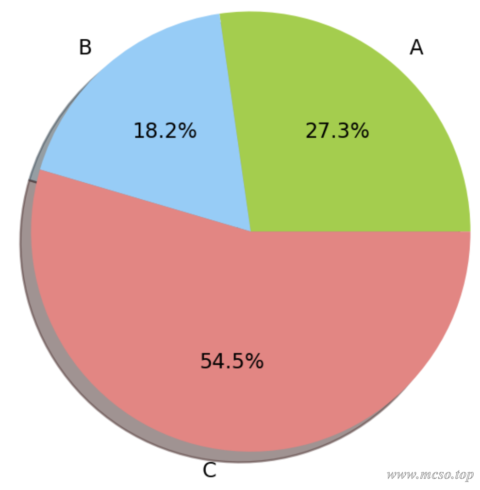
raster chart
A raster map generally refers to a raster image. Raster maps are also called bitmaps, dot matrix maps, and pixel maps. Simply put, they are maps composed of pixels in the smallest unit. They only have point information and will be distorted when zooming.
The drawing of raster diagram refers to the above thermal diagram The drawing method.
Vector diagram
Vector graphics allow visualization of vector fields, such as physical lines of magnetic induction.
Use plt.quiver() Method can draw a vector diagram.
Code example:
dx = 0.1
dy = 0.1
x, y = np.meshgrid(np.arange(-1.05, 1.05 + dx, dx),
    np.arange(-1.05, 1.05 + dy, dy),
    indexing="xy",
    sparse=False,
)
u = x
v = -y
s = np.sqrt(u**2 + v**2)
plt.quiver(x, y, u, v)
plt.show()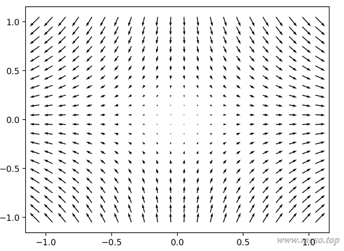
Tips
Show Legend
Use plt.legend() You can display a line chart or other chart legend, for example:
# 画出 sin 曲线
plt.plot(np.arange(0, 100, 1),
    np.sin(np.linspace(0, 10, 100)),
    color="pink",
    linestyle=":",
    label="sin", # 注意这里必须指定图例的标签,不然不会显示
)
# 画出 cos 曲线
plt.plot(np.arange(0, 100, 1),
    np.cos(np.linspace(0, 10, 100)),
    color="skyblue",
    linestyle=":",
    label="cos", # 这里同样要设置
)

# 显示图例
plt.legend(loc="upper left") # 图例显示到左上角
plt.show()
The function can also specify loc="" parameter to set the position of the legend, such as "best", "center", "right", "left", and so on.
Show coordinate points or text
Use plt.text() Method to add text to a coordinate point. The method has three parameters,x=..., y=... Provide the coordinates of the text point to be added,s=""for the text to be added, for example:
x = np.arange(0, 10, 1)
y = np.sin(np.linspace(0, 10, 10))
plt.plot(
    x,
    y,
    color="pink",
    label="sin",
)
for a, b in zip(x, y):
    # 为每个点增加文字,这里增加的是坐标点
    plt.text(a, b, "({}, {:.2f})".format(a, b))

plt.show()
Show Grid
Use plt.grid(True) The grid is displayed. Default plt.grid() The parameters inside the function areFalse, the grid lines are not displayed.
There's another parameter axis="both" Is the coordinate axis for which the grid lines are displayed, which can be "both", "x" or "y", and the default is "both".
Customize the scale of the axis
Use plt.xlim() andplt.ylim()to limit the range of the x-axis and y-axis,plt.xticks()and plt.yticks() to set the scale of the x-axis and y-axis. Examples are as follows:
x = np.arange(0, 10, 0.1)
y = np.sin(np.linspace(0, 10, 100))
plt.plot(
    x,
    y,
    color="pink",
    label="sin",
)
plt.xlim(0, 2 * np.pi) # 限制 x 显示 0~2π
plt.ylim(-2, +2) # 限制 y 轴从 -2~+2
# 设置 x 轴的刻度为 π 的几分之几
plt.xticks(ticks=np.arange(0, 2 * np.pi, np.pi / 2),
    labels=[
        "0",
        "$\\frac{1}{2}\pi$",
        "$\pi$",
        "$\\frac{3}{2}\pi$",
    ],
)
# 设置 y 轴刻度只显示 -1 0 1
plt.yticks([-1, 0, 1])

plt.grid(True)
plt.show()


